Baseline
In Collaboration with Katie Groshok
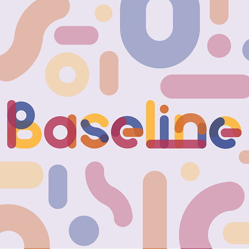
Baseline was the year-end show for the graduating class of the Bachelor of Design program (2023). The below design was presented to the graduate students as a potential concept, then cast to a vote against competing projects. The term ‘Baseline’ was selected to reference the journey a designer takes within the program,
and as such this project’s theme is
basic geometric form.
.jpg)
Project Overview
The purpose of this project is to create a concept that fulfills the fourth-year students' vision. The title of ‘Baseline’ was selected to represent the academic journey of starting from the base and growing upwards. This growth is nonlinear and is supposed to capture the idea of developing as people and designers. With these themes in mind, the assignment could be done individually or collaboratively.
Objectives
Create a cohesive grad-show theme that follows the inspiration given. Support final execution with clear branding as well as present final concept to graduates.
Personal Goals
-
Utilize hand-drawn and digital content throughout process
-
Distribute work evenly
-
Both partners are happy with final outcome
Professional Goals
-
Fulfill all deliverables to industry standard
-
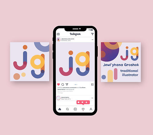
Create extra asset (Instagram filter)
-
Strong connection between show title and theme
-
Clear branding theme with bold visual presence.


Software Used
-
Adobe Photoshop
-
Adobe Illustrator
-
Adobe Indesign
-
Procreate
-
Media Spark Studio
Deliverables

-
Graphic Toolbox
-
Social Media Assets (6 static & 3 motion)
-
Web Banner
-
Posters (welcome and promotional)
-
Sample student profile
-
Extra: Instagram Filter
Process
-
Katie and I immediately knew we wanted to work together, and conveniently enough we had very similar concepts in mind.
-
Grain texture was a huge element we wanted to ad in as it followed current design trends, as well as met the request of the graduates to "play with textures."
-
When thinking of colour palettes we wanted to go with something that was relevant for the year and the theme, so we gravitated towards Pantone's colour of the year. With this magenta hue, we were able to build a colour palette that closely resembled the primary colours (going back to the idea of basic)
-
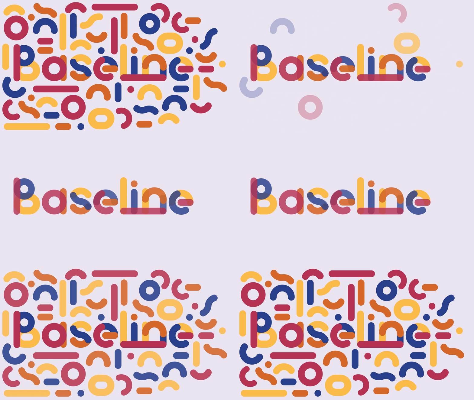
The geometric type was originally just created for the logo, but after playing around with shapes and the uncertainty of what to do for the student profiles, we decided to go for it and make an entire typeface.
-
After designing the basic assets we were able to share all the needed materials with each other so that we could work independently on small tasks.

Motion Graphics
Project Breakdown



Social Media Pots
Graphic Tollbox
Instagram Filter
Pf Graphics
Problem
How to effectively represent 'Baseline.'
Solution
Re-reading the notes the fourth-year students left was the only way to ensure the theme met the expectation. Taking the term baseline literally, it refers to a line of measurement within typography. Leaning further into the term ‘base’, we decided to take inspiration from the basics. Focusing on geometric forms and a slightly elevated primary palette allowed for a clear connection between the show’s name and theme
To ensure cohesion throughout all assets, a geometric typeface was made, obviously titled “baseline.” Each letter is made of the same 5 shapes and 4 main colors. This format allowed us to elevate each of our deliverables and visualize a clear brand identity. Going a step further we created an instagram filter, wanting to really pull our target audience and clients in.
Final Takeaways
One of the biggest takeaways I had from this project was the importance of file organization. When dealing with a variety of platforms and assets, it's so important to label everything! The other takeaway I had was learning to appreciate working collaboratively. Designers get so use to doing their own routine, it's very eye-opening to see how another creative tackles a design project. I hope to continue being able to work collaboratively with Katie in the future.
Responsibilities
Taryn
-
Social Media Assets (Still)
-
Motion Graphics for Pf
-
Promotional Poster
-
Typeface
-
Project Overview Slideshow
Katie
-
Web Banner
-
Social Media Assets (Motion)
-
File Organization
-
Thumbnailing and Idea organization
-
Welcome Poster

